 |
|
|
|||||||
| View Poll Results: Who should be Tyria's Next Top Model? | |||
| Burnout Chic |
|
118 | 41.40% |
| Jaden Stone |
|
136 | 47.72% |
| The person that should've won was already eliminated!!! |
|
31 | 10.88% |
| Voters: 285. This poll is closed | |||
 |
|
|
Thread Tools | Display Modes |
 Jan 12, 2007, 06:59 AM // 06:59
|
#501 |
|
RAGE INCARNATE
Join Date: Apr 2006
Location: Sitting at The Guild Hall 2, being happy.
Guild: Nerd Clan [NK]
Profession: R/
|
I will NOT stand for Ele Abuse!!!! *takes up arms*
|

|
 Jan 12, 2007, 04:01 PM // 16:01
|
#502 |
|
Krytan Explorer
Join Date: Nov 2006
Guild: The Shadow Tower
Profession: A/
|
..*laughs hysterically*
I love armor though @___@ *always wanted that armor for her ele* *sobbers* (<-- that's sob. not sober with two b's >_> i randomly do that to my emotes) |

|
 Jan 12, 2007, 05:53 PM // 17:53
|
#503 |
|
Krytan Explorer
Join Date: May 2006
Guild: Silver Millenium
Profession: E/Me
|
Yeah, scheduling is becoming a big issue now that some of us on panel are also going to back to school/work/etc. Hopefully, things wont change drastically, but if they do, I'm sure it wont matter since this cycle is almost up! Of course we will have to take it into consideration if we take up on a second cycle...It feels so fast, but in a month or so, we will have our first winner, hopefully one of many! lol
|

|
 Jan 12, 2007, 06:01 PM // 18:01
|
#504 | |
|
Jungle Guide
Join Date: Dec 2006
Location: UK
Profession: W/
|
Quote:
mm x_X Bondage S&M ??? |
|

|
 Jan 12, 2007, 06:33 PM // 18:33
|
#505 |
|
Forge Runner
Join Date: Sep 2005
|
My mesmer looks so posh and wealthy 
|

|
 Jan 13, 2007, 01:13 AM // 01:13
|
#506 | |
|
Desert Nomad
Join Date: Jan 2006
Location: Lost in the sands of time...
Guild: Blood Of Orr [BoO]
Profession: R/Rt
|
Quote:
 I start second semester next tuesday, Im so used to not being there It's going to be so weird I start second semester next tuesday, Im so used to not being there It's going to be so weird  At any rate, i hope that there is many more cycles! This is so much fun 
|
|

|
 Jan 13, 2007, 05:14 PM // 17:14
|
#507 |
|
Krytan Explorer
Join Date: May 2006
Guild: Silver Millenium
Profession: E/Me
|
Week 5 deliberations, in random order...
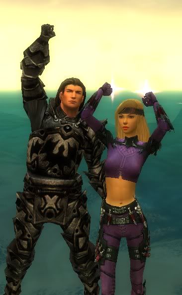
Summer Newmentz with Jerym Blazewalk 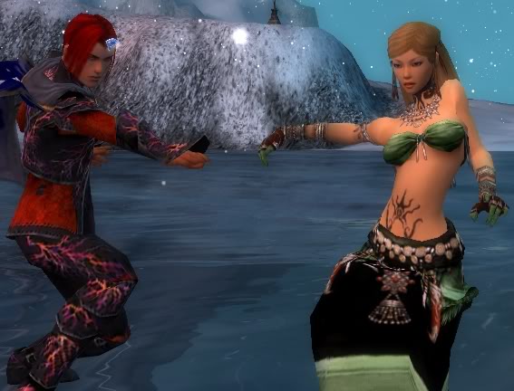 The evening was approaching in the guild hall of Summer and her leader, as the evening was coming their level of boredom had risen greatly and they finally decided to go skating out on the ice. Everything was going great even with Summer's blindness. The picture caught here was when Summer's aid caught a shot of the two skaters releasing grasp before Summer goes into a spin. Unfortunately that did not turn out too well and Summer ended up on her rear end. Judge 1: Safe. Not good, not bad, same comment as before...which isn't a good thing, your progress has pretty much flat lined on us. Your picture isn't bad, but you're going to have to up your game if you want to continue to be in the competition, that is if you pass this round. Judge 2: You continually fly under our radar, granted you never crashed and burn, but in retrospect, you never wowed us. If you're really serious about wanting to win this competition, you're going to have to push the envelope sometime or another, or your just counting down to your last days. Judge 3: I actually like this picture, there's some interaction with the male model, and this makes for a good movement shot, pose is very interesting. Malefic Mistress with Dumm Bumsentard 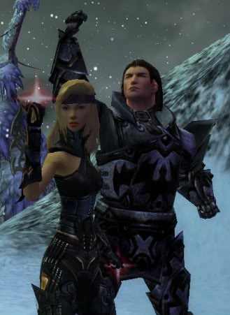 When i was taking these photo's I had found a nice spot that was free of monsters, we were trying many different poses when suddenly a red dot came from the side of the map and was coming directly twords us, we both did a fist shake to try to make the moster back off. Judge 1: I like the picture, it's very in your face, don't mess with this. And by reading your explanation, I totally got it. Judge 2: I was a bit disappointed actually, this picture was really "the best of the worst". You won the challenge last week and were allowed to send in three pictures, and I really didn't care for any of them. This one isn't bad, but I think you could've chosen a better background, one that was a tad bit brighter, and you shouldn't have gone matchy matchy with your male model, especially same color. Judge 3: I think this shot is very dominating, the explanation was fun, the picture was strong, Dynamic Duo is what I get. Burnout Chic with Elegant Swordsman 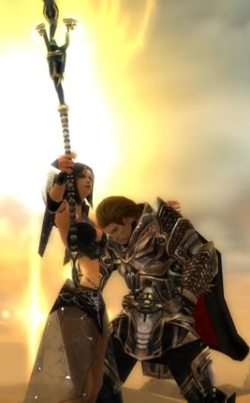 the desert is full of danger, Burnout and Elegant Swordman fight side by side, because it takes more then magic or melee alone to defeat the enemy. Burnout Chic is calling to her magic powers to protect them both, while Elegant swordsman is protecting her weak body before the spell is ready. Judge 1: For such a bright background, I don't know how you two got shaded, again, bad lighting. Judge 2: I think everyone should take note about this, please get a second opinion about lighting on screens, because we've been saying bad lighting, bad lighting, bad lighting, and I don't think anyone has improved on that. Reference: http://img.photobucket.com/albums/v4...BExample05.jpg (You have the luxury of looking at your selects and picking the best one, there's a clear difference Judge 3: Your explanation doesn't work for me, it looks more like he's tired and resting on your shoulder while you pick up the slack, which is fine, cause clearly, you're the dominant presence. I guess it could look like he's shielding you...? Xo Katina Xo with Minister Of Manly 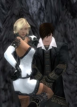 This pose is like "Yin and Yang". The place outside of Ember Light Camp highlights the black and white colors on the armor very well. The Male Mesmer has his outfit as black with a white trim, while Katina has her armor white with a black trim. They are like opposites. Judge 1: Absolute perfection. You are completely right about the lighting Ember Light Camp has, you were very conscientious about the armor colors. I seriously would've died if you just had your male model used the mesmer mask which had the half/half colors or especially the that covers just the one eye. That would've wreaked couture, couture, couture and in all honesty, would've just blown the competition out of the water. Either way, absolutely stunning. Reference: http://img.photobucket.com/albums/v4...Example05b.jpg (Had you've done that, I think you could've possibly taken the competition to a whole new level) Judge 2: This could possibly be the "it" shot. And I agree, if you had your male model worn the mask, this shot could totally fill any high fashion editorial. You totally looked in charge, you nailed it. Judge 3: I love this picture!!! Your character showed the best interaction between models, I love the illusion that you're leaning on him. The pose is so hot, but not sleezy, this is amazing! Perynne Walker with Argo Shanks 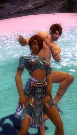 Argo and Perynne are posing with the lovely hues of the jade sea beaches behind them. They are both from a Luxon guild, therefore the sight of jade always feels like home. I wanted to capture one of their more restive moments, with Perynne striking a pose and Argo doing a mock double take behind her. Judge 1: It's a nice picture, but I've seen it before. What else can you do? This goes for everyone, give us range, give us variety. I think if anyone would choose to show a picture doing a similar pose they had before, then at least shift the angle. Judge 2: I loved the picture with this pose before, but the way it is cropped in this picture, it kinda looks like you're about to sit down on the toilet. The pose is a tad bit awkward when cropped like this. Otherwise, its not so bad. Judge 3: Agreed with the posing, you don't want to be considered a one note, just take note of it and be sure to give us more range in your abilities, cause I know rangers, as does every job, have a wide array of emotes to use and tons of angles to use them in. Mortissia Faust with Ghost Spookje 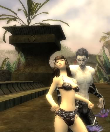 My male model is a very very very good friend of mine, and his birthday is coming up soon. He frequently checks my status in the competition and is a great friend in general. While he was AFK one day at the Guild Hall (Uncharted Isles), I sneaked up on him and posed in front of him. He was wearing his usual attire (No chest piece, only leather pants and gauntlets... he likes exhibitionism hahaha) so I decided to pose nude to compliment his dressing style. Judge 1: I think taking a picture with your male model afk completely defeats the purpose of working with a male model. The goal of the shoot was to see how you can interact and work with another person, if I wanted you to work with an afk person, then we would've repeated the statue shoot. Judge 2: Clearly, there is no interaction between characters, if you were going to do it afk, I would've at least attempted to capture the male model while the afk head movements were in effect. If you did it like that, least you could simulate him looking at you. Judge 3: The least interactive group. Didn't quite meet the idea of working with a male model. Raselle Deathblade with Unknown. 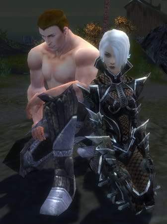 Raselle Deathblade, and her longtime friend, are seen sitting near the coast of Hunters Isle, taking in the fresh air, and enjoying the view. Judge 1: First, the male model wasn't named, and secondly, the pose was similar to a previous one, again, if anyone does a similar pose, at least change up the angles. Judge 2: It's surprising to me, first week, I think you were one of the ones who kinda stumbled on the guidelines of the assignment, and again, you didn't fulfill the guidelines in naming your partner. And looking at your picture, if I replaced your male model with the wolf you had previously, I think i could get the exact same shot. Judge 3: It's disappointing, but you weren't careful with the rules, and your shot was a bit safe this week. Jaden Stone with Langola Magicks You 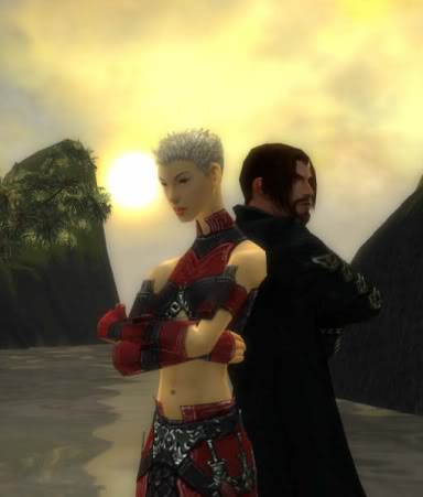 I call this shot "The Argument". A basic portrait of a couple after a fight. I was going for a shot I could see a unisex fragrance would use for advertising, "Passion, For him or her." It may seem like a very simple shot but a lot of thought and effort went into doing it right. I chose a nice light backround the help contrast the dark armor dyes and also a nice yellow sky to highlight Jadens skin. I think Jaden remained the star of the show and the black mesmer armor was perfect to contrast her red armor. Judge 1: I like the picture, I like the positions of you and your male model, back to back type deal, its nice that you tried to come up with a story for your picture. Judge 2: I love the androgynous features your character has, and I think the angle you showed really captures that, I really think you would've had a better shot if you had a more feminine male to compliment and contrast your androgyny. Usually, male mesmers would do the job, but unfortunately for you, you managed to grab a more masculine mesmer. Judge 3: I kinda like the little theme you tried to incorporate in your picture...the picture itself is a little boring, but not bad. Alright, we have our scores and alot to deliberate on, good luck to everyone! |

|
 Jan 13, 2007, 07:03 PM // 19:03
|
#508 |
|
Desert Nomad
Join Date: Jan 2006
Location: Lost in the sands of time...
Guild: Blood Of Orr [BoO]
Profession: R/Rt
|
eeks.
 I knew i should have went and re-dyed another set of armor for that pic  I did try my purple armor for this pic and it looked pretty silly I did try my purple armor for this pic and it looked pretty silly  At any rate, very very nice shot Katina - Awesome pose! Last edited by xxSilhouette; Jan 13, 2007 at 07:08 PM // 19:08.. |

|
 Jan 13, 2007, 07:13 PM // 19:13
|
#509 |
|
Wilds Pathfinder
Join Date: May 2006
Guild: The Agonized
Profession: Rt/Mo
|
O M G! Katina, that is absolutely GORGEOUS. 100% Gorgeous.
And uh oh, Im scared >.< I did the assignment totally wrong, but I have no regrets... when my friend reads it, I do hope he'll be very happy I sneaked up on him. But yeah, looking at the comments, I think I'm in super super high danger. But tis was fun. Beautiful shot Katina! And good luck to everyone else! p.s When you read this, Happy Birthday Ghost >.> Last edited by Geishe; Jan 13, 2007 at 07:15 PM // 19:15.. |

|
 Jan 13, 2007, 07:25 PM // 19:25
|
#510 |
|
Frost Gate Guardian
Join Date: May 2005
Location: A place far away from where I want to be.
|
My unofficial responses to the photographs. Because bad photographs bug me.
Summer Newmentz with Jerym Blazewalk Unofficial Judge W -I like the pose, and the framing of the overall picture, however, your choice of background for the characters is poor, its too offsetting, and detracts from the "happy" implied by your picture. The background just muddies up the whole picture, and theres no sense of composition really, everything in the background gets in the way. Additionally, the ele has his third eye on, which is also off-putting to me. Malefic Mistress with Dumm Bumsentard Unofficial Judge W -I'm sorry, but even the pose is bad in this, the characters blend together, and the background, while snow, isnt bright enough to offset the dark armor, I like the hill cutting through from right to left downward, hate the tree in the left side, it ruins the composition, also, poor lighting, but thats probably the location picked. DONT BE AFRAID OF THE BEACH. Burnout Chic with Elegant Swordsman Unofficial Judge W -FINALLY some composition in the overall picture! Had the sun been moved up fully to the upper left area (as to surround your staff head) the composition would be even better, the backlighting is good overall, and theres enough foreground light to not have characters shadowed, but the warrior seems like the focal point, not the ele, also, he has his cape on, which brings additional, unneeded and distracting (yes minor, but still) color into the shot. Last thing : cutting off at the knees is OK, because of the pose you were going for, but cutting off the top of the stave? Not that good. Taller picture and fix the few minor things and it would be great. Xo Katina Xo with Minister Of Manly Unofficial Judge W -Good choice of setting, good choice of lighting, the white against black is perfect, although a more "set back" background would be preferred, also, while I understand the intent of the shot, the male mesmers pose is detracting, bring the full right leg boot into the pic, and shave some pixels off the right side (to even the spacing from katinas right elbow to the edge ~= Minsters spacing from left elbow to edge, overall though, great composition, good choice of colors and lighting, and a background that doesnt detract from the focal point of the shot, the characters, more specifically, Katina. And the masks? No, that would be horrible to have them on. Perynne Walker with Argo Shanks Unofficial Judge W -First off, WHY IS HE NAKED? Second off, beautiful colors, for your ranger armor to blend right in with. Great if you are trying to be a ranger and like, sneaking around and such, bad if you are trying to take a beauty shot. I LIKE the four bands in the baclground, and their placement in realtion to the characters, but if a character is going to be lit up, why not make it the focal point of the shot (namely, the ranger, the contestant, not the naked sin? fluting in the background). Mortissia Faust with Ghost Spookje Unofficial Judge W -WHY ARE THEY NAKED? WHY WHY WHY? Your background is incredibly busy, with lots of things there to distract you from the glowing flesh in the picture (incredibly enough). I dont mind the pose, and the general shapes implied by the architecture around you both, however, the fact that you went without colorful armor and the only actual color in the picture is the two purple flowers in the lower right, really just throws this one off for me. Had you been wearing bright, busy armor (as rits CAN have) and set up the necro in a convincing CLOTHED pose, then the background might've worked. Also there is no real lighting considered in the shot. Raselle Deathblade with Unknown. Unofficial Judge W -Again with the lacking of the armor bits. Do I have to say it? Well I will anyway. WHY???? Generic pose, no real background to speak of, and what little there is, you just blend right into. Not to mention that the warrior takes most of your attention away by having bright pink flesh exposed. I give you credit that you didnt cut off your characters in any way, but you didnt take into account that you have two dull yellow flowers growing out of your head. And backlighting! Without any foreground light! Bad! Jaden Stone with Langola Magicks You Unofficial Judge W -FINALLY CLOTHED CHARACTERS. Anyway, a pose that I like both the male and female of! Overall, the shot shows sense of awareness of composition, and attemps, quite well, but with some minor nitpicks, namely, the mountain on the right side cuts into the male at an odd angle, and removes his folded arms, the suns placement is not ideal, higher, above the heads wouldve been better in my mind. Backlighting is an excellent choice in this shot though, as there is enough foreground lighting to not drown out the characters in shadow, despite the males dark armor. Had they been framed by the mountains, rather than intersected by them, and the sun slightly higher in the shot, it would be an excellent shot. Note to all: While the facial expressions overall did take away from some shots, I didn't comment on it because of GWs static facial features. I understand this is a limitation imposed by the nature of the game, so I didn't hold it against any of the shots. This was meant to be a useful (albeit harsh) critique of your shots so that you can hopefully make better shots in the future. I am not the be all to end all, I'm quite sure that there are people who disagree with me, and thats fine. This is only MY critique of the shots in question. Feel free to ignore me entirely. One last thing: Do not be afraid to take a hundred or more pictures trying to get that one perfect shot. When photographing, more IS better. And sorry, but no, quantity will not guarantee quality, you still have to be mindful of things that make a good picture. |

|
 Jan 13, 2007, 07:32 PM // 19:32
|
#511 |
|
Wilds Pathfinder
Join Date: May 2006
Guild: The Agonized
Profession: Rt/Mo
|
Hello Wyrnn, you had really nice comments, at first, I actually thought you were another one of the judges... before I read unofficial >.<
But I think you missed out on reading some of the explanations. It would explain some of the points you advised. But nigh, thanks for your insights. |

|
 Jan 13, 2007, 07:53 PM // 19:53
|
#512 |
|
RAGE INCARNATE
Join Date: Apr 2006
Location: Sitting at The Guild Hall 2, being happy.
Guild: Nerd Clan [NK]
Profession: R/
|
First thing I thought when I saw Katina's was: "Ouch."
Really looks like shes planting a nice flying knee into the guys jewels. *cowers in pain* But otherwise great pictures everyone. 
|

|
 Jan 13, 2007, 07:55 PM // 19:55
|
#513 |
|
Frost Gate Guardian
Join Date: May 2005
Location: A place far away from where I want to be.
|
"Explaining" a photograph doesn't make it better, and no offense, but, as the judges pointed out, in the case of yours, it actually detracted from the intent of the shot.
I chose to focus on only the most basic "guidelines" for the shot, meaning, the female character/contestant was supposed to be the focal point. Everything else, including explanations, I disregarded. Not because they arent important for the competition, but because they arent important to a great photograph. (I'm really not trying to be condescending in this next part, but I know its going to sound that way, so I'm pre-apologizing for the way it sounds) When you go to an art gallery, you don't get an explanation of the art (be it a photograph, painting, whatever) included with the piece (at least, most of the time, and any time there is an explanation as to the mind set, intent, or anything else about the piece excluding maybe a small blurb about the artist or maybe a bit of trivia about it such as "he used 300 different paints to get this one color" or whatever, but actually describing the piece, it detracts from it, IMHO) I understand what you are saying, but I chose to ignore the explanations in critiquing. -Wrynn |

|
 Jan 13, 2007, 08:25 PM // 20:25
|
#514 | |||
|
Ascalonian Squire
Join Date: Jun 2005
Guild: GWonline Guild(GWO)
Profession: N/Mo
|
Quote:
Quote:
Quote:
Now, I know my time in this contest is almost up. As unfortunate as it may seem, that's just how it is. I enjoyed this contest immensly, and would do it again in a heartbeat. But lately, I've been growing distant from Guild Wars. The only times I would log on, would be to grab a few screenshots for the contest. I believe that the winner of this contest should be someone who enjoys the game, not someone who doesn't. I also knew my entry this week was not the best. Possibly one of my worst, even. I knew that, and still, I willingly sent that email. I would've rather gave it one more shot, then have just said: "I give up", and not sent in anything. Anyways, Ladynilene, judges, fellow contestants... Thanks. This was fun, and I really enjoyed it. Best of luck to the rest of you. :-) Also... If by some stroke of luck, I do happen to make it to the next round... I will gladly continue to participate. But I doubt that. *Is a total pessimist.* :-P Also... Wrynn, thanks for the review. I agree with everything you said about the shot. |
|||

|
 Jan 13, 2007, 08:38 PM // 20:38
|
#515 |
|
Academy Page
Join Date: Mar 2006
Location: The Netherlands [Woot]
Guild: Looking for a decent one :P
|
Very nice shot Katrina allthough it looks like u're giving your male partner a knee in the nuts.
 (Ouch) Keep up the good work. Last edited by Wtf?Omfg!Bbq!; Jan 13, 2007 at 08:43 PM // 20:43.. |

|
 Jan 13, 2007, 08:56 PM // 20:56
|
#516 | |
|
Krytan Explorer
Join Date: May 2006
Guild: Silver Millenium
Profession: E/Me
|
Wow, Unofficial Judge W, I'm very impressed, alot of what you had to say kinda coincide(to some extent) with what my panel had to say. One thing that I noticed, is that maybe you're looking at this as more as an art/photography type deal versus as a fashion viewpoint. Which is not a bad thing! Because generally speaking, both of those coexist and depend on each other lol
Of course the naked thing was a problem, trust me, it was a problem for us on panel as well. But one thing that this Cycle has, is absolute freedom. I probably should've asked every character before applying how far/which campaigns/etc a character has so I could be more direct with photoshoot themes. So when I see all the people who chose to do "naked" shoots, we see it as, ok, maybe its a lingerie theme, maybe a fitness type deal, the bulk of male modeling does lie within fitness modeling, some of them were even on the beach, where guys are generally shirtless, so we had to take alot into account when judging. And I agree with the explanation, as Wrynn said as well, sometimes it can take away from your shot. If there's so much going on, it just becomes so overbearing, and ultimately just makes your picture unappealing. Anyways, if we do replace a judge, I would hope you'd, Judge W, sign up for the position, that is, if you're into that kind of thing. I think you would fit in well lol Of course that is, if we do choose to replace, which I am so against, but if we do...lol The only problem I saw with your comments is when you said Quote:
|
|

|
 Jan 13, 2007, 09:23 PM // 21:23
|
#517 | |
|
Frost Gate Guardian
Join Date: May 2005
Location: A place far away from where I want to be.
|
Quote:
As far as me being a judge, I dont think I could do that, as I am close personal friends with one of the contestants. so bias would be a factor (and that friendship is why I commented in the first place). As far as taking a hundred photographs, while that isnt a good idea for a "normal" person with a regular point and shoot (although most people have digital now, so its even more of a non-issue) Actual fashion photographers DO take hundreds of photographs for that one "perfect" shot. As well as most artists (certain exceptions exist, but thats venturing into other topics). I myself am an amateur photographer, and I would be willing to say, for every thousand pictures I took, I got two actually worth keeping around to show friends/teachers/whomever. Out of every 5000 pictures taken, I mightve gotten ONE that could actually be put on display and actually make me feel like a real artist, instead of someone who just buys lots of film.. But as I said, digital is largely making this obsolete, despite the fact that my nice digital camera still cant take good black and white photos like my 30 year old mechanical SLR can. |
|

|
 Jan 13, 2007, 09:32 PM // 21:32
|
#518 | ||
|
Wilds Pathfinder
Join Date: May 2006
Guild: The Agonized
Profession: Rt/Mo
|
Quote:
Yush, it was fun. Thanks judges for setting up such a fun thing for everyone to enjoy.. (regarless of participating, or watching the contest develop) I do hope this goes on for more cycles, and I will glady donate my time to help this cause. GOOD luck to everyone! I'll be here watching your every move, muhahaha. OMG and yeah, good luck to anyone having exams in the following two weeks, dont let TNTM get in the way of your studying!!! *High five Raselle {We're cool like that ^.^"} Quote:
You know what the funny thing is? My job at an art gallery is to describe the art to visitors requesting for tours, etc. And like you said, I think each time I explain it, it makes the visitors view point about that piece of art a little different... so I agree that it detracts from the piece of art (or photography). But heck it pays well, and I need to save up for my future education >.< boooooooooo. GOOD LUCK EVERYONE! Thanks again, Raselle and I will be partying the night away. |
||

|
 Jan 13, 2007, 09:34 PM // 21:34
|
#519 | |
|
Furnace Stoker
Join Date: Oct 2006
Location: Jawsome!!!!!!!!!!!
Guild: looking for one :p
Profession: A/D
|
Quote:
i thought burnouts was rly gd but the warr defetly looks more tired than protecting |
|

|
 Jan 13, 2007, 09:51 PM // 21:51
|
#520 | |
|
Desert Nomad
Join Date: Jan 2006
Location: Lost in the sands of time...
Guild: Blood Of Orr [BoO]
Profession: R/Rt
|
Quote:
 Im not complaining at your thoughts or anything, But I'm NOT AFRAID OF THE BEACH!!!!!!!! I tried shots there and naturally when i had the choice to send in three pictures i am going to send in the stuff for the one that the judges agreed are best. Yes i made a mistake with the lighting and i made a mistake by wearing black armor. I have learned from it and will remember it as long as i am in this competition or any time i am in a competition like this. EVERYONE makes mistakes, and sometimes they learn from them. I have and I will remember it. And again, Im not complaining - Beacuse i take critisism and use it, so i do appreciate it - But I think you were assuming I went to one place for pictures and that was it. I didn't do that - I went to many different places and took around 300 screen shots, Then sent in what I thought was the best 3, not what anyone else thinks is the best 3, what I thought is the best 3. The judges choose that one and i went with it. Overall i thought a lot of people did well - I see mistakes in each and every pictures (except katina's  - excellent job!!!), But i see something good in each picture as well. Good job everyone! - excellent job!!!), But i see something good in each picture as well. Good job everyone!Also apologizes, I am having a really bad day relating to personal issues, which is why i may be coming off harsh. Life sucks =X 
|
|

|
 |
|
«
Previous Thread
|
Next Thread
»
| Thread Tools | |
| Display Modes | |
|
|
All times are GMT. The time now is 05:27 PM // 17:27.


 Linear Mode


